FANDUEL LOBBY SIMPLIFICATION
OVERVIEW
I led the redesign of our lobby leading to an 8.23 % INCREASE IN USERS ENTERING A CONTEST.
THE PROBLEM IN TWO PARTS
1. USERS ARE FRUSTRATED
User research has told us our user are overwhelmed with the current lobby. It’s confusing, full of dense and irrelevant content, and overall hard to know where to go.
2. DAILY FANTASY USERS ARE VALUBLE
Daily Fantasy users are valuable to the wider FanDuel Group. Losing a Daily Fantasy customer is the equivalent of losing Sportsbook and Casino customers.
The current design was hurting the Broader FanDuel Group as a whole.
Crammed
Endless Scrolls
Redundant Information
Little Hierarchy
No Direction
All looks the same
Hard to know where to go
Confusing Naming
Dense and Irrelevant

THE CURRENT LOBBY IS…YIKES! 😬
REDESIGN OR SIMPLIFY?
We wanted to do a huge redesign.
But that would be an expensive effort for all (design, product, engineering).
Part of the Daily Fantasy approach was to be budget conscious
So we decided on simplifying the lobby instead
REDUCE. PRIORITIZE. ORGANIZE.
REDUCE.
Reduce the overall content.
prioritize.
Prioritize key info relevant to the user and the business.
Organize.
Organize content to support key user journeys.
All while being approachable

COMPONENT EXPLORATION
We audited all the components and removed any we deemed unnecessary. The ones we decided to keep, we explored redesigned components (example below)

We Prototyped and tested many layouts.
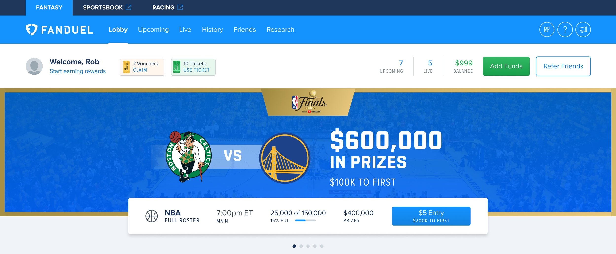
MARQUEE DESIGN & INTERNAL PARTNERS
Working with our Game Ops and Sponsorship teams, we needed to provide a clear space to highlight marquee games. Both were key business initiatives and we needed to account for:
Sponsored games (like HULU),
Key Matchups (NBA Finals)
Generic enough banner options for flexibility.


INITIAL ROLL OUT
We did an initial roll out to a small percentage of users. All key metrics were positive. After a few fixes we rolled it out to the entire customer base.